Concept, Theme and Structure
Before you start with your design, determine how the brochure will be used. Is it for direct mail marketing or for information or to advertise products? Also, acquire all the needed information for the brochure so that you can choose the appropriate design for it. Make sure that you are able to give the message directly to those who receive the brochure.
Unique and Creative
Your brochure design should be unique or eye-catching so that people could easily recognize it with one glance. Think of a design that will stand out.
Size
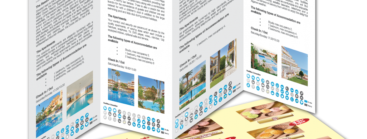
In order to create an A5, A4 or folding brochures, you will need to know how many text or pictures you have for the entire brochure then from there you can decide either the brochure in single sheet, booklet format or folding format.
Use Print Bleed
Bleed refers to the part on the edges of the paper that gives a small amount of space. This is an assurance that it can be trimmed well and all parts of the layout will be printed. Brochures are printed together in sheets and it needs to be trim according to the right form, shape and size. It is always advisable to use bleeds in lay-outing.
Use High Resolution
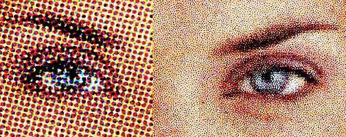
Your design will look pleasing if you will use high resolution in your layout. If you print a design with low resolution, it will become blurry or pixilated. You should use at least 300 dpi to have a sharp print output.
Usage of Fonts
Selection of fonts is important. Choose the ones that will fit the purpose of the brochure and the company. Remember to use the right font/sizes or corporate font because brochures are meant to deliver information. Hence, it should be readable and legible. Use bold fonts for headings and do not make your text too large or too small. You can add glow, bevel or drop shadow to highlight important text.
Headlines, Bullet Points, Charts and Images
You need to simplify what is written in your brochure. No one would like to read massive blocks of text in a small sheet of paper. To make it easier for the eyes, use headlines and bullet points. You can also make use of charts and images. Images should be in high resolution. Choose appealing images because the readers will first look at the image before reading the text. This will grab the reader’s attention especially to the important points of the brochure.
Make Attention-Grabbing Designs
For whatever purpose your brochures will be used, make sure it is an attention grabber. Use your creativity in doing this. There are times when brochures are left in counters. Customers will surely want to get a copy if they find it interesting. So, make sure you will make an eye-catching design.
Use the Correct Paper
Even if the client merely asked you to make the design, you should also suggest and consider the paper that they will use for printing. Your brochure design will be useless if you will not use a good paper. Choose the appropriate paper such as glossy/ matte papers, thicker or heavier paper makes the customer think that the company is more professional.
Make It Worth Keeping
If you had a good design for the brochure and it also contains vital information, the customer might love to keep it. There should be something in the brochure that will increase its value and will make it worth keeping. You may want to use pop out images or make a different shape for your brochure to make it unique.
In making a brochure design, these are the things that you need to keep in mind in order to make it noticeable. Since you are the designer, it is your obligation to impress the client and to put into action their ideas for a great brochure. Your client relies on you to achieve their purpose. Hence, you have to give your best into it.
